Introduction:
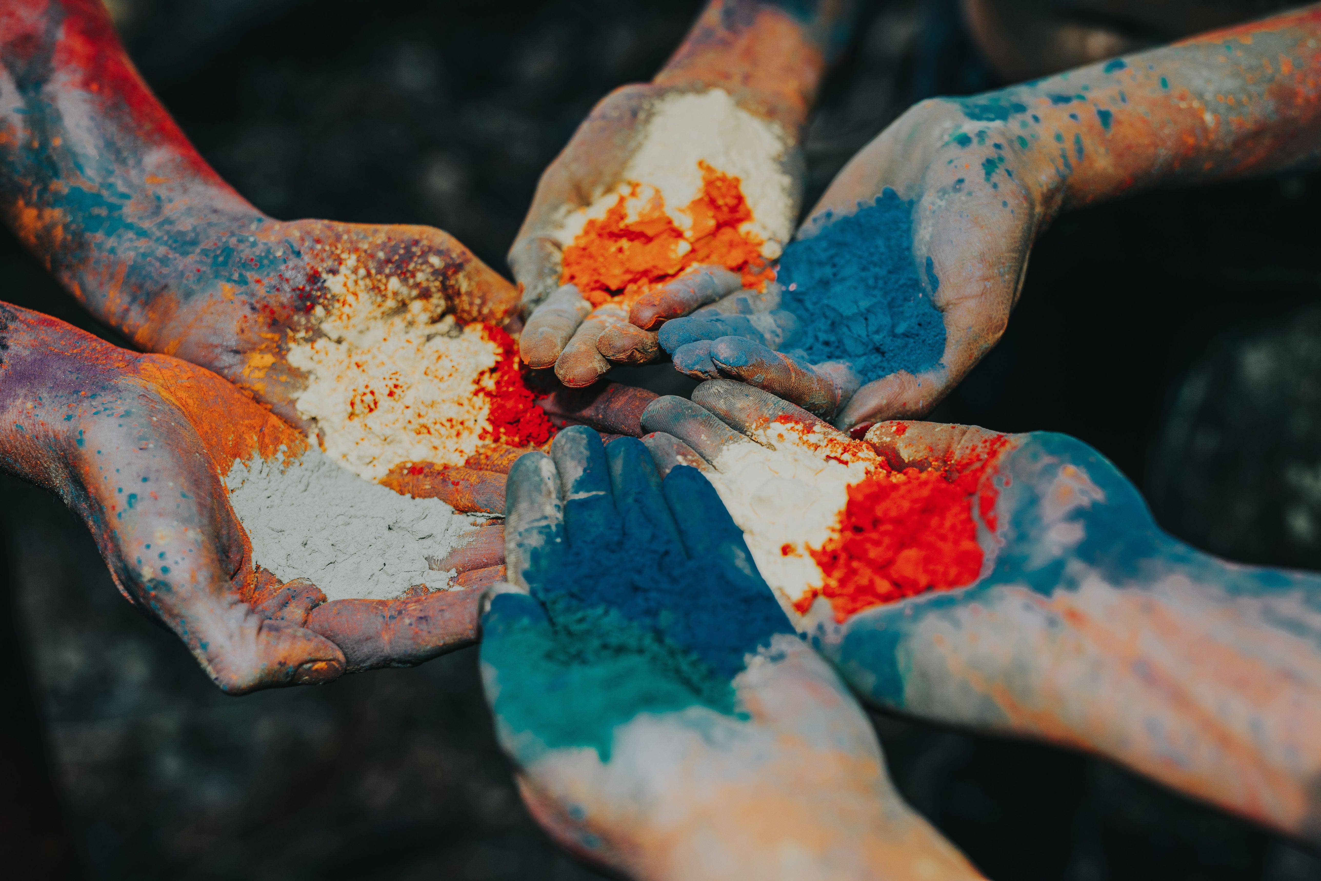
Choosing a colour palette is one of the most important factors in creating a recognisable brand. There’s a lot to get wrong, and a lot to get right in the process. This article will show you how to create an entire palette in 5 minutes.
We, as designers, are frequently constrained by strict guidelines. Even modest hair salons and recreational soccer clubs have developed their own brand colours and visual tone of voice, thanks to design systems and corporate identity style guidelines.
However, if you are fortunate enough to be a part of a rebranding effort from the outset, you will be confronted with one of the most tough branding difficulties straight away. The most crucial stage in building an identifiable brand, other from picking the proper typeface, is choosing brand colours and a colour palette. And there's a lot that can go wrong along the way. However, there is a lot to get right.
For your next project, I'll show you how to turn a single colour into a full-color palette. But first, let's decide which colour to use as a base:
What is the best way to choose the right base colour for your brand?
What colour comes to mind first when you think about your favourite brand? It's black and white for me. Even if we disagree about whether those colours are genuine, they remain the Apple brand's unique colour feature. White is associated with simplicity and minimalism in colour theory, two qualities that most of us associate with the legendary company that gave us the iPhone in 2007.On the other hand, black represents strength, elegance, and refinement. This seems about right, doesn't it, when you look at the two portions below taken from Apple's website?

Apple’s black and white colouring symbolise minimalism, simplicity but also power and elegance. Facebook’s blue conveys intelligence and trustworthiness. In order to choose the right colour for your business, it is important to understand the various connotations of certain colours. Here’s a great article you can read for this.
Create your colour palette
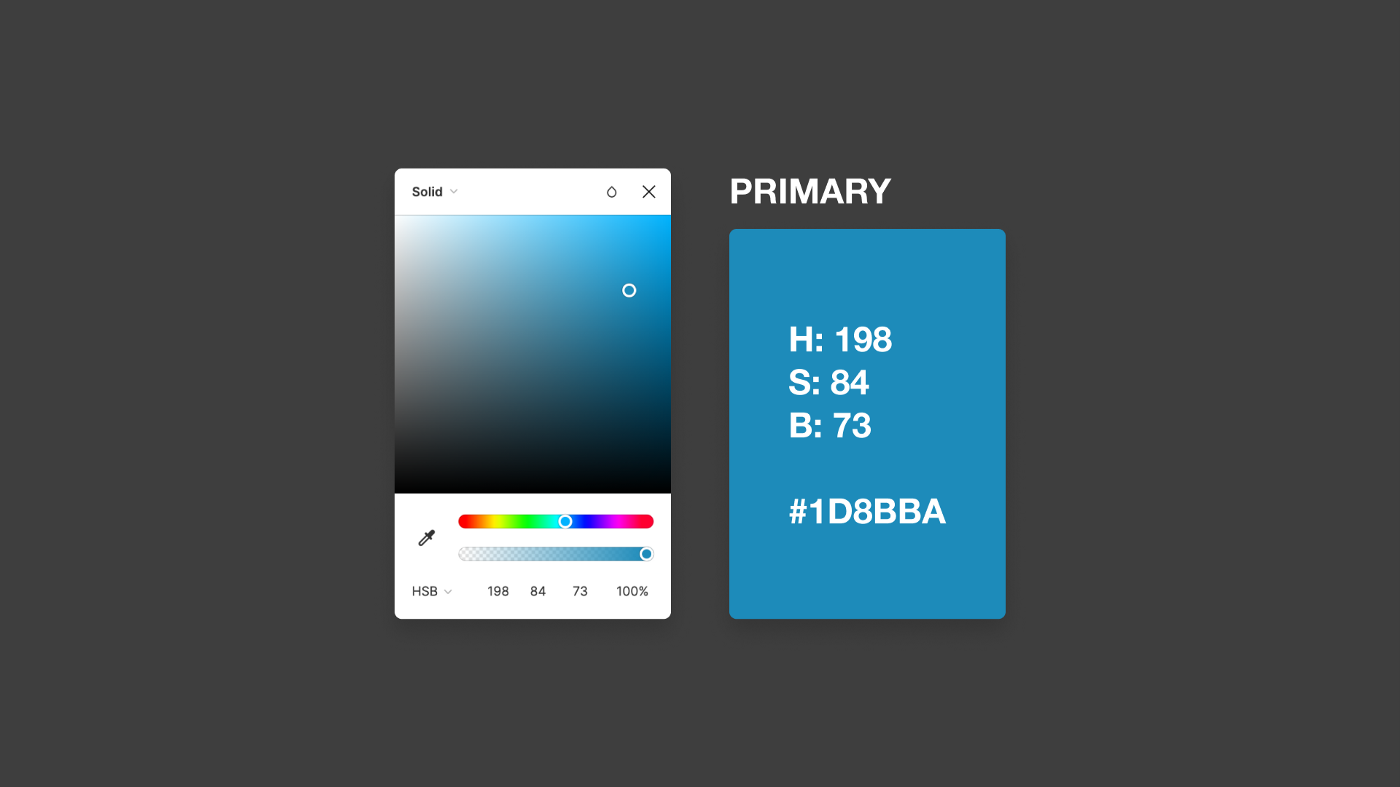
After the base colour has been determined, open a design program such as XD or Photoshop. The important thing to note is that you choose hue-saturation-brightness (HSB) as the colour model and choose your first colour.
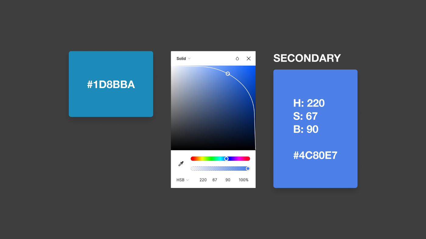
In order to make a rich colour palette, we need a secondary colour. You can use a shade which is darker or lighter than the first colour, or a complementary colour. Shift the hue control as far as you desire to create different colour schemes. Use the hue control as many times as you want to come up with more and more colours to create a bold, eye-capturing and effective scheme.
Lastly, we'll make our tertiary colour by moving the hue slider to the left-hand side of the arch. This gives me a subdued green tone that blends nearly perfectly with the first two tones in my colour pallet.
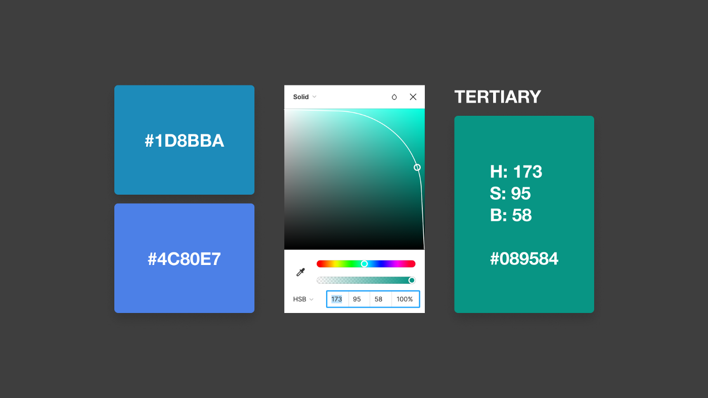
by changing the hue sliders positioning by just a tiny bit, the color scheme I am creating is a very balanced and rather sober one. If I would have chosen to make the hue distance between my colors wider, my palette would be a lot more vibrant. So with this little arch-technique it is completely up to you, If you opt for a subtle scheme or a more crazy and progressive one.
I repeated this process a few times in order to get more colors and end up with the following scheme for my project: